There is an art to presenting data in an engaging way that keeps your audience’s attention and leaves them wanting more.
I’ve given some highly commended presentations and some not-so-good presentations. One segment of a rather long, data-centric presentation – that happened to be quite important – stands out to me as probably the worst. It had really great potential but fell flat. I presented what I considered to be exciting data, yet my audience was not wowed. If anything, they became slightly antagonistic – or, at best, apathetic. What was my problem?
How Data Presentations Go Wrong
After some reflection, I realized that I did not convey the overarching story supported and driven by the data I was presenting.
If we fail to communicate the insights portrayed by our data, then we have not fulfilled our basic duty as analysts. Communicating the significance of data, or even conveying the basic meaning of a graph or chart, can be a challenge. Knowing how to effectively communicate the value portrayed by our data empowers our presentations to impact decisions and succeed. Here are some data presentation tips to that end.
How to Present Data Effectively
- Simplify the Graphics – Present your data with streamlined graphics that are easy to understand.
- Develop a Narrative for Your Data – Identify the main message and structure your narrative around it.
- Describe the Impact in a Relatable Way – Put the impact in concrete terms your audience cares about.
1. Simplify the Graphics
One of the first keys to displaying data effectively is to present data sets in a way in which they can be absorbed by the audience. Typically, the individual visualizing data with graphics is much more familiar with the data than those to whom the information will be presented. Without familiarity, data can be, rather understandably, more challenging to assimilate.
Experts in data visualization share that making graphics as streamlined as possible can help the message of the graphic be easier to consume. These tips can help you simplify your graphics:
- Remove any unnecessary clutter or distractions.
- Stick to the essential elements that convey the main message of the data.
- Avoid using too many colors or complex visual elements that might confuse the audience. Instead, opt for a clean and minimalist design that allows the data to take center stage.
- Use clear and concise labels. Make sure that the labels are readable, providing a clear explanation of what each data point represents.
- Consider how your items are ordered or arranged so visual comparisons are simple.
- Ensure your type of graphic (pie chart, stacked bar chart, line graph, etc.) is appropriate based on the type of data.
Remember, the goal is to use graphics that accurately represent the data and make it accessible to everyone, regardless of their level of expertise.
Let’s look at some examples.
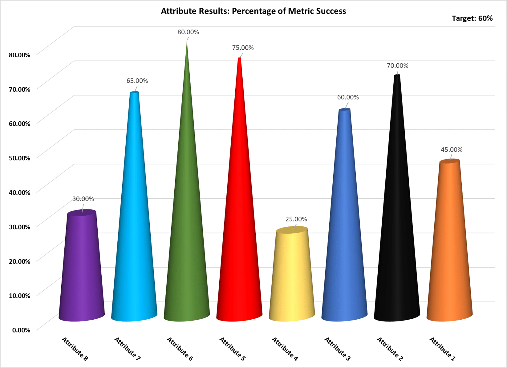
Example: How you should Not use graphics in a Data Presentation
Consider Figure 1 (definitely an example of what NOT to do). It (fictionally) portrays a chart representing attribute breakdown, but it comes across as cluttered and challenging to read. Worse, the meaning of the information is not readily apparent. The graphic should draw attention to the attributes that are not successful, but obviously fails to do so. Another approach is needed.
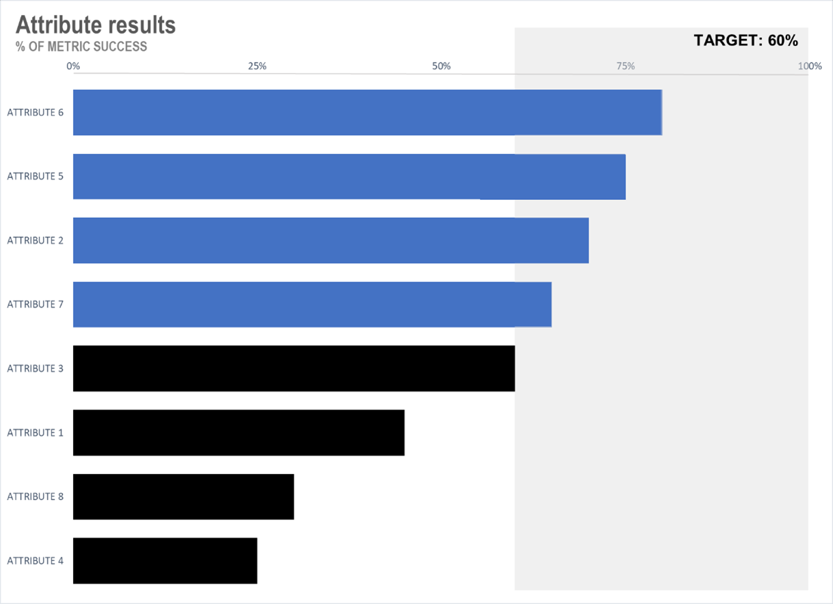
Example: How you SHOULD use graphics in a Data Presentation
Now, consider Figure 2. The design is simple and clean with only a few colors that have adequate contrast. Labels are clearly visible. Attributes are ordered meaningfully.
Vinod Khosla, one of the founders of SUN Microsystems, believes that for a slide to be successful, a person should be able to remember it after five seconds of viewing. Thus, a slide should be understandable within five seconds – and that implies that the essential meaning of a successful data graphic must be readily comprehendible.
2. Develop a Narrative for Your Data
A top purpose of a data-based presentation is to empower others to feel confident about making informed decisions based on the presented insights. The audience needs to not only understand the data, but understand how it impacts their efforts. A compelling narrative engages the audience and helps them connect with the data on a deeper level.
Robert McKee, in Story: Style, Structure, Substance and the Principles of Screenwriting, said that if a person does not have the ability to tell a story, even their brilliant ideas turn as “dry as chalk.”
If our data presentations do not tell a meaningful story, then our best ideas and the most motivational insights crumble. The message of the data can often best be conveyed in the form of a data story that tells – in a practical, accurate, but relatable way – the importance of the data insights.
The following strategies can help you develop a data story that can be clearly conveyed to your audience:
- Start by identifying the main message or key insights that you want to convey through your data. What story does the data tell? Is there a trend or pattern that emerges?
- Once you have identified the main points, structure your narrative around them. Use clear and concise language to explain the significance of the data and why it matters.
- To make your narrative more engaging, consider using real-world examples or anecdotes that explain its relevance.
By developing a narrative, you can transform your data from a collection of numbers into a meaningful and impactful story.
3. Describe the Impact in a Relatable Way
Finally, when presenting your data, it is crucial to describe the impact in a relatable way. Instead of relying solely on numbers or percentages, put the data into context that the audience can easily understand and – perhaps more importantly – actually cares about. Ensure the key takeaways are prominent and actionable.
Often the best choice, for business purposes, is to put the outcome in terms of money. Recently, I gave a presentation containing data-based recommendations of how my client could make more profitable choices. The VP-level recipients were interested in the work but seemed much more highly motivated after the recommendations were tied to an estimate of how much money could be saved. That information provided a concrete, readily understandable measure and gave the executives the knowledge they needed to act.
For example, if you are presenting data on the increase in pollution levels, you might say, “pollution levels have increased by 20%.” This may be accurate, but is not easily visualized. Instead, you could say, “the increase in pollution is equivalent to adding 10,000 cars to the road every day.” By using relatable comparisons and translating the impact to more approachable terms, you make the data more actionable.
Insights for Successful Data Presentations
Years ago, when I made my worst presentation, I wish I had known these tips for presenting data. I wish I had better understood that data without context or insight rarely leads to impact or action. With that knowledge, and a little bit of elbow grease, the presentation could have been transformed into a helpful display of meaningful missives.
Nancy Duarte, in her book Slide:ology: The Art and Science of Creating Great Presentations, says “each presenter has the potential to be great; every presentation is high stakes; and every audience deserves the absolute best.”
Using keys for superb data communication can empower our presentations to be great – to convey valuable insights and to succeed. Our data science consultants can help your team effectively communicate with data to reach your goals. Reach out to our team to learn more about our approach to data analytics and visualization.